A great website doesn’t happen by accident. It’s the result of a clear, repeatable website design process that translates business goals into a fast, engaging, and trustworthy digital experience. When teams skip steps, projects drag on and results underwhelm. When teams follow a thoughtful sequence from strategy to launch, the work feels calm, timelines hold, and the site performs on day one.
In this guide, we’ll walk through the seven steps of the web design process, explain why following a framework protects your budget and your sanity, and show you how to plan structure, optimize UX across devices, and craft an interface that people genuinely enjoy using. You’ll also see how we weave simple, real‑world search phrases into content so it ranks and reads naturally no keyword stuffing, just clarity.
7 Steps Of The Website Design Process
Every successful build follows a shape. The exact deliverables change with scope, but the sequence stays steady. Here’s a practical, human‑centered flow you can rely on.
1. Strategy
Strategy sets the foundation. Before any pixels move, you need clarity: who you serve, what they need, and how the site will help them succeed. We define business goals (leads, bookings, sales), audiences and jobs‑to‑be‑done, competitive landscape, and the messaging that will win attention in that context. We also establish success metrics and constraints, budget, timeline, compliance, brand requirements so decisions fit reality.
Good strategy is specific. It connects the dots between problems and pages, not just slogans. By documenting the website design process steps at this stage KPIs, primary actions, and a north‑star narrative you give designers, writers, and developers a single source of truth. That alignment is how projects ship on time without rework.
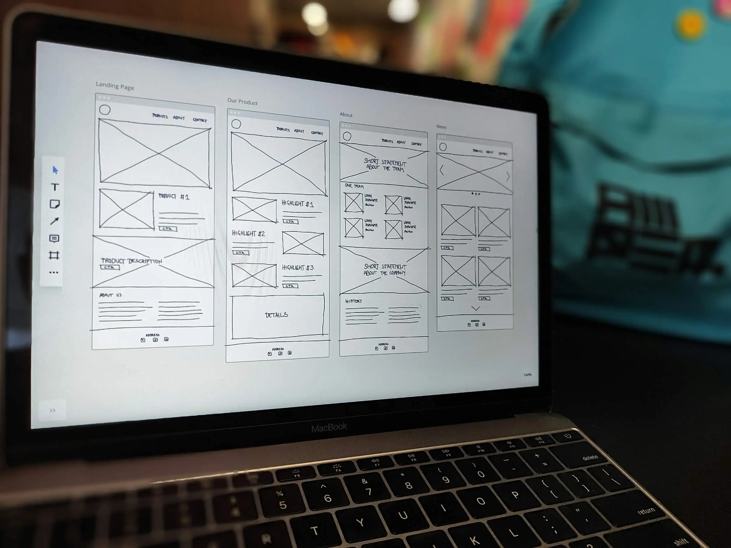
2. Planning
Planning turns strategy into structure. We create a sitemap that lists pages by priority and purpose. We draft wireframes that show hierarchy, not decoration what goes where and why. We map content: what copy, media, and proof points each page needs to move a visitor forward. We also select a platform and supporting tools based on goals content‑driven sites often thrive on WordPress; stores on Shopify; simpler sites on Squarespace or similar.
The planning phase also covers analytics and SEO basics. We define events (calls, forms, bookings) and configure clean URLs, page titles, meta descriptions, and internal links. A strong plan is the backbone of the web design process it informs scope, reduces surprises, and keeps budgets honest.
3. UX & UI Design
User experience (UX) and user interface (UI) translate structure into something people can feel. UX clarifies the journey: navigation, page flow, and content choreography. UI brings brand to life through typography, color, spacing, and components. Together they remove friction, build trust, and make every next step obvious.
Design should be inclusive and purposeful. That means readable type, strong contrast, focus states for keyboard users, clear labels, and generous spacing so content can breathe. Microcopy button text, field labels, empty states matters as much as visuals. When the UI mirrors real user intent, bounce rates drop and conversions rise.
4. Styling
Styling turns approved UI into a system the whole site can share. We codify tokens colors, typography scales, shadows, radii, spacing and build reusable components like cards, banners, and form elements. A consistent style system makes new pages cheap to produce and hard to break, while keeping performance tight.
We also shape motion. Subtle transitions communicate status and reduce cognitive load: buttons respond, panels expand smoothly, forms confirm success. The goal isn’t flash; it’s feedback. When styling is consistent and polite, the site feels more expensive and more trustworthy.
5. Frontend And Backend Development
Development turns designs into a fast, accessible website. Frontend work covers semantic HTML, modern CSS, and lightweight JavaScript that enhance usability without slowing the page. Backend work sets up content models, routes, security, and integrations with tools like CRMs, email platforms, and analytics.
Performance is a feature. We budget for speed early: compress images, preload key assets, minimize render‑blocking scripts, and test on real phones. We also build for maintainability clean components, sensible content fields, and guardrails so editors can update content without breaking layout or accessibility.
6. Quality Assurance
QA is where craftsmanship shows. We test across browsers and devices, validate forms and flows, check copy and links, and confirm that analytics and events are firing as expected. Accessibility checks cover color contrast, keyboard navigation, focus order, alt text, and ARIA where appropriate. We also run performance audits and fix issues that create jank: layout shifts, large CLS, slow LCP, or sluggish input response.
Great QA saves launches. It prevents regressions, protects rankings, and ensures the experience matches the intent defined back in strategy. It’s where the web design process proves its value.
7. Launch & Post Launch
Launch is a checklist, not a champagne cork. We handle DNS, SSL, redirects, sitemaps, robots directives, and final pre‑flight tests. Then we watch logs, analytics, and uptime closely for the first 48–72 hours. If the site replaces an older version, we map legacy URLs and preserve equity so search visibility doesn’t dip.
Post‑launch, the work shifts to optimization. We monitor conversions, study heatmaps, and ship small improvements regularly: clearer headlines, faster images, upgraded forms. A cadence of incremental wins outperforms giant overhauls. A living site guided by data keeps earning more over time.
Why Should You Follow The Web Design Process
A repeatable process protects budget, timeline, and team energy. It removes ambiguity, front‑loads the hard thinking when it’s cheap, and aligns everyone on what ‘done’ looks like. Stakeholders know when to give input; specialists know what to deliver. Momentum builds instead of stalling.
From an outcomes perspective, process drives quality: clearer strategy yields tighter messaging; planned structure yields stronger UX, consistent styling yields fewer edge‑case bugs; disciplined QA yields stable launches. The result is a site that feels cohesive and performs measurably better. In other words, following the web design process is the shortest path to great work and the cheapest way to avoid doing it twice.
How To Plan Your Website Structure
Start with goals, then reverse‑engineer the sitemap. Identify the minimum set of pages that get a visitor from landing to action without detours: home, top services or categories, an about page that builds trust, and a contact or booking page that’s friction‑free. If you’re local, add location or service area pages, if you sell, add product or package pages that answer real objections.
Each page should have a job. A service page might need a benefits section, process overview, pricing context, proof (reviews, certifications), and a primary call to action. A category page needs filters, featured items, and clear paths deeper. Thinking in jobs keeps navigation simple and copy specific two traits that make content rank and convert.
Plan internal links from the start. Use descriptive anchor text, connect related pages, and avoid orphan content. A thoughtful structure helps both people and search engines understand what matters.
How To Optimize UX Across Devices
Most visitors experience your site on a phone, often on the move. Design mobile‑first: larger tap targets, sticky CTAs, readable type scales, and layouts that put the main action within a thumb’s reach. Avoid hover‑only interactions, ensure focus states are visible, and collapse long sections behind clear labels.
Performance is usability. Optimize images (modern formats, correct sizes), limit scripts, and defer non‑critical assets. Test form flows on real devices: autofill, numeric keyboards, input masks, and clear validation messages cut abandonment dramatically. Then confirm the desktop experience takes advantage of space generous line lengths, comparisons side‑by‑side, and imagery that earns its weight.
How To Design A Highly Engaging Interface
Engagement comes from clarity, credibility, and momentum. Clarity means headlines that say exactly what you do for whom. Credibility means proof positioned near claims logos, numbers, and testimonials. Momentum means every section ends with the obvious next step: view pricing, see case studies, book a demo.
Use contrast to communicate hierarchy: bolder headings, quieter body text, and accent colors reserved for actions. Keep components lean and responsive so they load fast and adapt naturally to different screen sizes. Help users decide with microcopy: explain what happens after they click, set expectations for response time, and reassure them about privacy and cost. A highly engaging interface respects attention at every step.
Faq’s
Q: What are the seven steps of the website design process?
Strategy, Planning, UX & UI Design, Styling, Frontend and Backend Development, Quality Assurance, and Launch & Post Launch. The names vary by team, but the sequence is consistent.
Q: How long does a typical website project take?
Lean builds using proven templates can launch in 3–6 weeks. Custom projects with complex features often take 8–12+ weeks. Content readiness and timely feedback are the biggest schedule levers.
Q: Why is strategy so important?
It aligns the team on goals, audiences, and constraints. When strategy is clear, design and development move quickly and decisions stick reducing revisions and cost.
Q: Do I really need wireframes?
Yes. Wireframes separate structure from styling. They make information hierarchy obvious and speed up design approvals.
Q: What’s the difference between UX and UI?
UX is the overall journey flows, navigation, and logic. UI is the visual layer typography, color, spacing, and components. Both are required for a site that feels effortless.
Q: How do you test accessibility?
We combine automated checks with manual testing: keyboard navigation, focus order, color contrast, alt text, labels, and screen‑reader spot checks. Accessibility helps everyone and improves SEO.
Q: Which platform should I choose?
Pick the platform that fits the job: WordPress for content‑heavy sites, Shopify for ecommerce, Squarespace for simple brochure or portfolio needs. The right choice lowers total cost of ownership.
Q: How do I keep the site fast after launch?
Set a performance budget, compress media, limit plugins/apps, and schedule quarterly audits. Treat speed as a feature and test on real devices.
Q: What should I track in analytics?
Define conversions (calls, forms, bookings, sales), set up clean events, and monitor top landing pages and search queries. Use insights to guide your next iteration.
Q: How often should I update the site?
Ship small improvements monthly: a case study, a FAQ expansion, a speed fix, or an A/B test on a headline or CTA. Iteration beats annual overhauls.